 I’ve fallen behind on Panini press releases due to some being sent out in PowerPoint format and then having no free time. So, I’ve decided to focus on a release that I did purchase some packs of and that is currently my favorite Panini non-gaming product available.
Here’s a picture of the Big Al base card. It’s not often that you see a basketball set where all of the cards have a landscape layout. While I do like these cards, I do feel like there’s a lot of empty space on the cards that could be better utilized. The biggest culprit? That giant blank area to the right of the action photo. You’d think that the picture would look best if it fell right in the blue stripe? Unfortunately, that space is reserved for this:
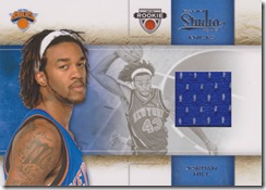 Jersey swatches. On its own, this is a nice looking jersey card, but the problem is that it wrecks the design of the base card. The majority of the cards that you are going to pull out of a box of cards are the base cards so this is a problem. It makes the base cards feel like an afterthought.
 The bad design carries over to the autograph versions of the base cards. The stickers go right over the action photo. I really hope that in the future that Panini stops using the same designs over and over again for regular cards, relics cards and autograph cards. It’s the one thing, and it’s a huge thing, keeping them from producing top notch sets. They still feel like the second tier company doing things like this and serial numbering the heck out of everything to create extra “hits.”
 I was just goofing around with the design and chopped off the empty space on the right. Doesn’t that make the card look better? There’s still an awful lot of empty space though. Is it possible to reduce the empty space even more?
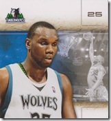 Now I’ve chopped things down even more. This card no longer has the player’s name or the brand name, but that can be easily rectified in the next step.
One thing that you may notice is that this is getting closer and closer to a portrait layout. You can have some landscape cards in a basketball set, but when you’ve got players who are this tall you’ve got to go portrait.
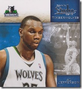 Look, the picture is now in the stripe created by the set brand name and the player name. Doesn’t that look much better? Yes, some of the action shots used in this set are wider than this, but they’re black and white. Panini shouldn’t be using the best action shots they’ve put on cards to date in B&W backgrounds. Use basic shots in the background and this design will work without a problem.
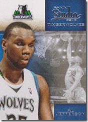 The final problem with the design was that it was no longer standard card sized. I’ve fixed that in the final step. You’d obviously want to crop the picture of Big Al a little differently so that he fits onto the card a little better, but I think you get a good idea here even without doing that.
Yes, this final design might need a couple of tweaks, but I feel it looks much better than what I started with. You can keep the same design for the relic cards if you want, but don’t print the B&W picture on those cards. I’m really not a fan of that though so it wouldn’t be happening in this set. I think an awesome set would have this for the base card and the jersey cards the way they are now. Use the same basic idea, but tweak what needs to be tweaked in order to deliver the best looking product possible.
You know why the best looking overall set that Panini has released this year is Adrenalyn? No relics or autographs to be designed around. It’s as simple as that. The etched foil cards are especially sharp looking and I’d like to see Panini use some of that going forward instead of the rainbow foil that they use far too often.
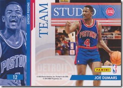 The Team Studio cards are an interesting idea and Panini loves their two-sided cards. Personally, I’ve never enjoyed collecting cards where the player that I like is on the back. I’d rather have two players on the front than one on the front and one on the back. This is just personal preference and maybe no one else cares. On the reverse of this card you’ll find Bill Lame-beer. Sorry, but there’s no way that he’ll ever be making an appearance in this blog.
 The Masterstrokes cards are slick looking. You’ve got the photo studio with the large player images on the base cards and you’ve got the art studio on these cards. I would call these the best cards in the set, but there’s another insert set that does it even better. That set brings the theme back to the photography side of the studio.
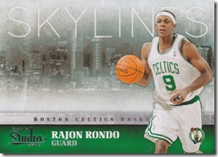 These Skylines cards are one of the best things that I’ve seen come out of any product this year. There are team colors which I love and it’s something different. Yes, Upper Deck did something similar in the past, but that was over a decade ago. Yes, there’s a lot of empty space, but it showcases the image of the city. In this case you get a nice view of the Boston waterfront. The players really pop on these cards.
Outside of the card blogging community, I’m a collecting abnormality. I don’t care how sick the hits are if the cards don’t look good. I’ve passed up cards for my player collections if the design is terrible. I don’t have to have anything. I want to have a collection that makes me happy.
Panini has been doing a great job on delivering hits and I’ve seen some beautiful cards come out of their products. The on-card autographs in Classics are amazing. They just need to step up their game when it comes to their base cards. The high end releases are starting to come out now and I’m sure that the majority of their designs are set for this year, but I’m hoping that the base card situation improves with next year’s releases.


2 comments:
Yeah, Studio isn't my favorite set, but I love the Skylines cards. I think I'm about halfway finished with it.
It's so close to something that I would love, but designing for the relic window just kills so many of their designs for me.
I either need Panini to step it up in the design department or for the NBA to give Topps their license back. I also want a real sticker set with an album and the works.
Post a Comment